On Hiring and Style
We first set out to hire artists to make the first issue of Half-Life: A Place in the West back in early 2014. As with most things on this journey, we knew almost nothing about it, flew by the seat of our pants, made it up as we went along, and got incredibly lucky.
That said, hiring Heath Heil was one of the best and easiest decisions we ever made. When we found him, Heath was still in school and wasn't looking for a major commitment. He wanted to pencil something part time. We responded that we wanted him to the entire thing - penciling, inking, and colouring. For some reason, he said yes.
What made Heath stand out against hundreds of other applicants, to the point where we saw his work and immediately said "Yup, that's our artist"? It was his sense of style. Speaking as a non-artist, I think a sense of style is one of the hardest things for artists to carve out for themselves. It’s not just a matter of talent, but twisting that talent to your will, shaping it, and being able to make something your own.
As we're moving into production for Issue 3, we're finding ourselves in a place that we haven’t been in 3 years - looking for a pencil artist. With Issue 2, Heath took a step back and only did pencil work, and we brought on the wonderful talents of Ivan Miranda and Ester Salguero. Recruiting for an Inker and Colourist felt easier - we were evaluating them on simple grounds. Does the inking enhance the pencils? Does it correct instances of sloppy linework? Does the colouring evoke a mood and feel? Does it draw focus where we want it to?
We sadly did not save any of the artwork from the hiring tests we ran - but I have something that I think is also useful to see. The two images below were sent by two different artists applying for the colourist position. I don't know anything about the artists or their creations - I do not know if they participated in a colouring test that resulted in these shots, I don’t even know if either is “official”, or what comic this is from. I just think it shows really well how each colourist can take a different approach with the same image.
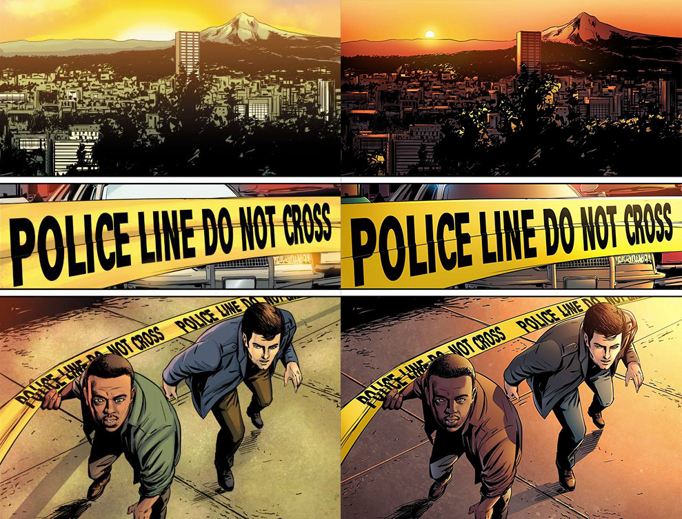
Night and Day. Literally.
You can evaluate these, as we did. You can see what you like, what speaks to you. The difference in mood, in feel, in style.
Hiring a pencil artist feels more difficult. They need to convey the scene, they need to know about framing, composition, anatomy. They have to be able to get expressions across. They need to be able to draw action in a way that is compelling and doesn't feel flat. They’re the first step in getting ideas onto the page. It isn't to say that they are more important - I think weak inks or colours can wreck a page as easily as weak penciling can. But it feels bigger because it starts the process of creating something from nothing. Where do you start with that?
There are writers who give their artists incredibly specific directions. I think of Alan Moore a lot, who wrote directions so specific for Watchmen that you could have panel descriptions that were literally entire pages. Of course, you also get some real genius from that approach, at least as it pertains to Moore.
Ross and I don't do that. It’s partially I think that we still lack the confidence of someone like Moore - after all, we've only written 3 scripts so far! But a big part of it, too, is that we treat this as a collaboration, and we try to hire people that know what works well. We want them to have the freedom to experiment, and to let their own experiences and imaginations guide them.
One of my favourite things is when an artist comes to us with a couple of options because they wanted to try some different approaches out. It's something that Ester even did with our promotional artwork for the A Place in the West soundtrack image (which is now used on our website as well).
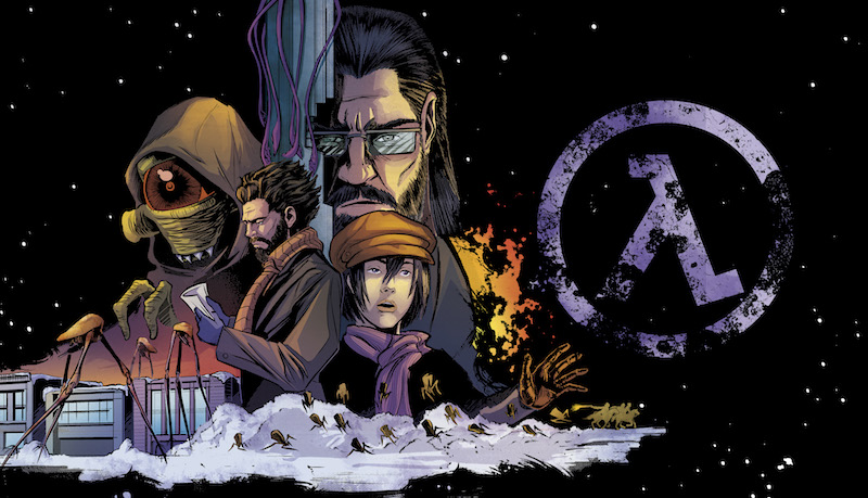
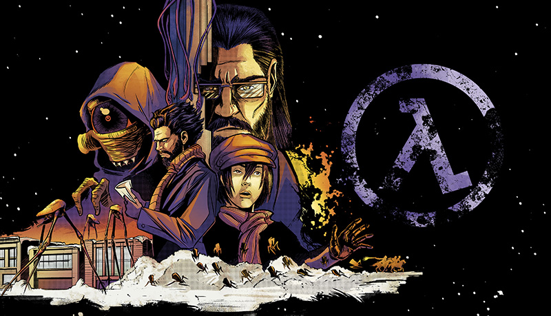
Two different approaches - one that's more realistic / true to the comic, and another that's more stylized like a game / soundtrack might be. And I honestly love both of them. Changing the colours produces a completely different feel. This works because Ester has and understands style. All people on our team do. And that's not just luck, it's intentional.
When you get hundreds of applications for a job from people who all have talent, you have to look at other factors. We look for things like how open they seem to be about collaboration, what their availability is like, how much they seem interested in the comic, and of course, what their sense of style is like.
This is tough for a single reason: A lot of artists don't have their own style. There are a lot of artist portfolios I get that just contain superhero artwork. I've jokingly said on some occasions that “superhero comics are the worst thing to happen to comic artists”. And it's because superhero art has a very specific look to it. It's exaggerated muscles, barrel chests, slim waists with large breasts.
It's stylized, which is not the same thing as having style.
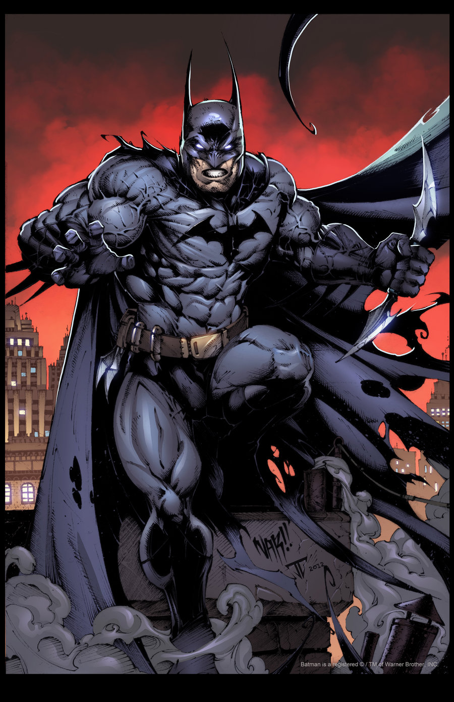
I am the night.
It's hard to evaluate based on portfolios of that - Yes, great, you can draw Batman. That would be important to me if I were making a Batman comic. But if I told you to draw a person, what would you draw? Would they still have those exaggerations? Could you make something without having decades worth of reference material? And what would that look like?
There's value in being able to mimic the style of another, and there's value in being able to tweak the style of another. But that's drawing in style, not with style, which is an important distinction. What stands out to me is people who can make it their own and have it stand on its own feet as something different. If you're going to send me drawings of Batman, I want to see how you envision Batman. How bulky is his armour? How does that work to his advantage? What kind of gadgets might he use? I've seen instances where his cape almost seems to be alive like Spawn, where his eyes are slits. How do you portray the things that make him who he is - his intimidation and fear tactics? His investigation? What do you focus on and how do you make Batman yours?
And of course there's a trade-off there, because when you have someone coming in to take over for someone else, or using someone else's characters, there's sometimes a concern for consistency. You don't exactly see comics going around and changing Superman's colours (without reason, anyway). But I still like to see what someone brings to the table to enhance what's already there.
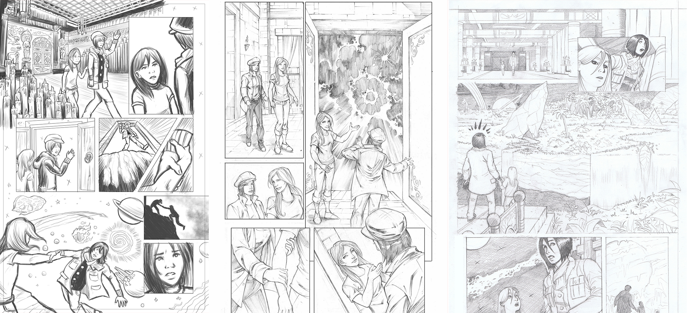
Unknown to, well, everyone who isn't me, this is the question that I ask when I look over art tests. What we began doing with Issue 2, and have continued into Issue 3, is that even when we find artists we like (we normally narrow it down to about 10), we give them an art test. Here's a penciled page to ink, here's an inked page to colour. With the process of hiring someone for Issue 3, the art test consisted of 3 things: A reference shot of Leyla, a reference shot of Ellen, and one page of the script. That’s it.
And here it is.
Page 2
INT. TEMPLE - DREAM
ELLEN and LEYLA are standing inside the temple, the doors closed behind them. The temple is coloured in rich carmine red and gold and draped in ornate silks, each wall lit from end-to-end with candles.
(1) ELLEN
"Do you remember this place?"
(2) LEYLA
"Of course. It's the temple I'd sneak off to when I was a child."
(3) LEYLA (cont'd)
"Who are you? Why're we here?"
(4) ELLEN
"It's the safest place for me to be right now."
They walk up to the opposite end, where the large double doors are open. Instead of the steps of City Hall that we'd expect to see, we are faced with a huge cliff edge, falling into a STARRY ABYSS and overlooking a SURREAL COSMIC PARADISE. It is unspeakably beautiful, like nothing you've ever seen.
(5) LEYLA
"Uh, woah..."
ELLEN clasps LEYLA'S hand with urgency. It's like she's seeing something Leyla can't. SCARED.
(6) ELLEN
"There's no time, they're coming. Listen-"
(7) LEYLA
"Who's coming?"
(8) ELLEN
"You must be careful... it stalks this place even in sleep."
(9) ELLEN (cont’d)
"I can't hide here forever, but..."
Suddenly, the world begins to melt away.
LEYLA turns back to ELLEN.
(10) ELLEN
"...I'll be waiting for you."
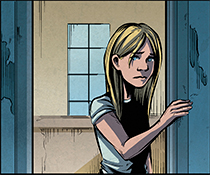
Ellen
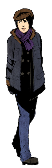
Leyla
You can see how this is simple. We want to see what people do with things like Buddhist Temple and Dreamscape. Leyla and Ellen are included for those who haven't necessarily read the comic, but I still ask, how do they make these characters theirs? Do they try to mimic Heath's style or go completely in their own direction? Do they try and enhance it in areas? What do they bring to the table?
Here are some art tests that we've gotten from people with the script above.
These art tests were all paid for, and I have gotten permission from the artists to use them for this post, but I have intentionally neglected to credit them because I don't want any comparisons to potentially reflect negatively on anyone. This is not about who we chose or why or what the strengths or weaknesses are of any individual submission.
What I want instead is to showcase how different artists work with the same prompt, the same canvas. We saw it above with the difference of sunrise and sunset, and now we see it where people create something from simply a few paragraphs. And in many of these drawings, we find style.